Bolt Hackathon - Week 2
I ended up getting distracted by a One-Shot Prompt Challenge Side quest (separate post coming). After getting that (mostly) out of the way I turned to tackling the layout and design issues this week.
Week 1, Week 2, Week 3, Week 4
TLDR;
I was going to pick up where I left off last week, but alas, ended up getting distracted by a One-Shot Prompt Challenge Side quest (separate post coming). After getting that (mostly) out of my system I turned to tackling the layout and design issues.
Late Start
I started the week with a side quest. For some reason talk of the One Shot Challenge spurred a bunch of ideas I couldn't shake off over the weekend. Thinking it would be a quick either it works or it doesn't I wanted to give the idea a go. Suffice to say, it was not quick, nor token cheap and it felt like only after Claude 4 got enabled I saw a satisfactory result. But that will be a separate blog post, once I submit that project.
Someone recently, rightfully so, compared prompting these nearly complete projects to gambling with a slots machine. There is definitely something to it, the excited wait and dopamine hit from seeing something that's just-nearly-almost-there... and maybe one more go and prompt tweak will fix it. It mainly did not. So I drew the line on the experimentation and came back to the project proper.
Social Icons
The last iteration from Bolt on the MyDragonLibrary did generate the social icons in the footer as requested, but not all of the brand icons were available from Lucide.

Admittedly the generated SVGs for Bluesky and Tumblr were pretty close, but I still went ahead with custom brand provided svg variants.

Much better.
Design Time
I tried to get back to working on the site's functionality, but the slightly off design kept grating on me. The half-baked photoshop sketches with a bunch of swatches were also not helping with design clarity.
In particular the logo was pretty mismatched with the emerging aesthetic. The colours and the style were a bit off and I just wasn't vibing with it. I knew my mind would keep getting distracted by this, so might as well give in and focus on getting the looks right before moving on to more functionality.
Many Many Logo Ideas
Back to the drawing board it was for the site logo then.
I tried to go a quick and easy route and use some online logo generators first. The idea being that if I got something generic it would be a better placeholder than the over detailed one I had now.
No such luck. Adobe Logo creator was a disappointment. I tried a few other online options, but again, dragon libraries, don't seem to be popular in the generic-logos-department...
So in the end, I went back to Midjourney. At least this time I had narrowed down some of the requirements. Here's a trimmed down list of the generations I liked (there were plenty broken or not really fitting ones along the way).
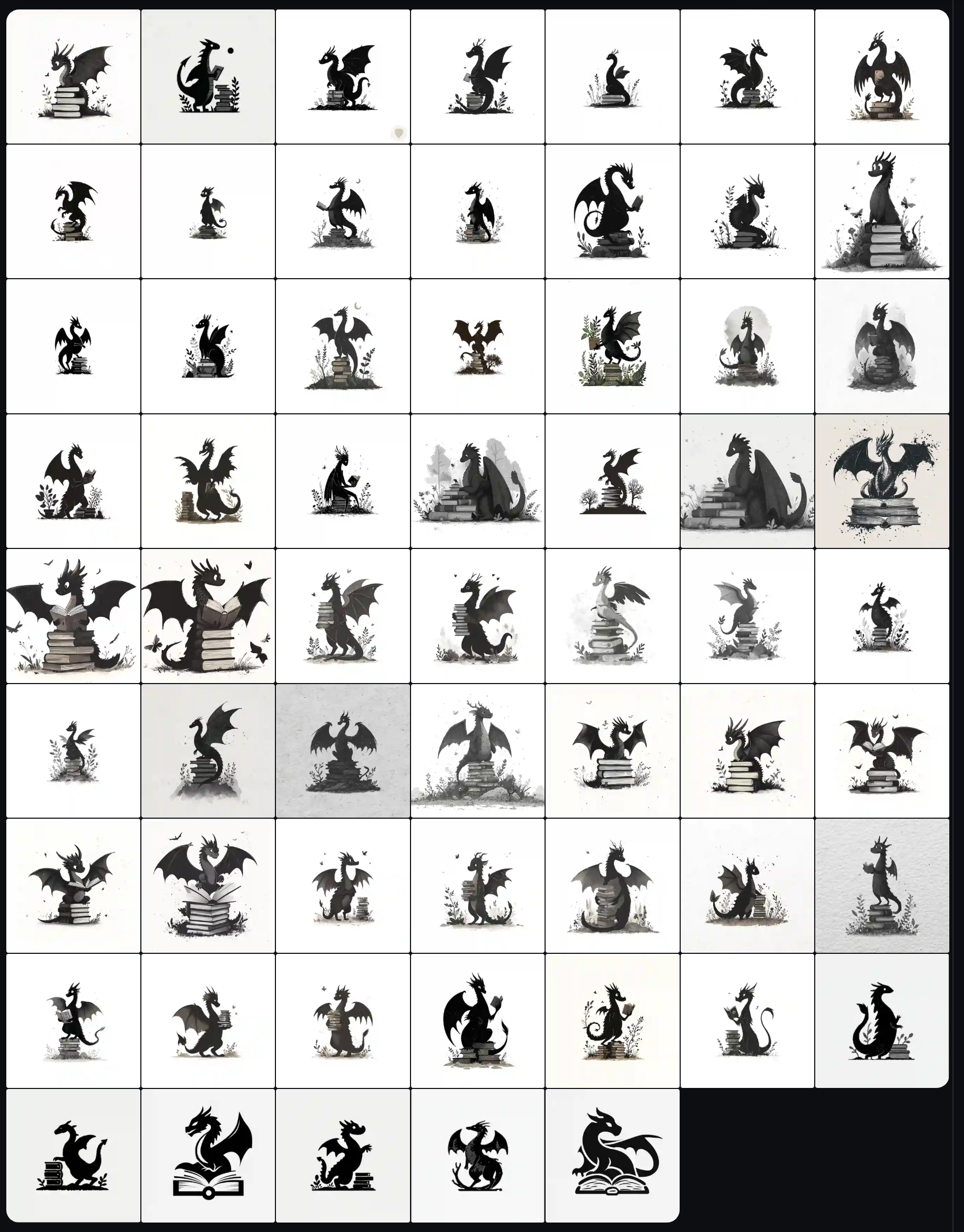
A big problem I hit with Midjourney, was that it only gave me really flat clean black silhouettes. The moment I wanted to include a bit of an ink wash, to soften the clipart look it would also add grain :/ Can't say I found a fix for that.
After half a day of going back and forth over different options I did try out my top picks in the design.
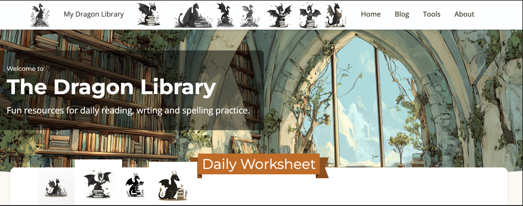
In the end some of the nicer looking ones had to go as they lost too much detail and looked washed out at the smaller sizes. Around this time I realised it really was time to ditch the random copy-paste-over-screenshot Photoshop mockup and spin up a Figma file.

The header mockup allowed for a quick comparison of the top options and in the end left me with this little guy as my top candidate.

He did need a bit of cleanup though. I liked his shape and the books, butterflies and nature elements, but it needed to be a simpler vector. Here ChatGPT was actually pretty helpful. And gave me the final (for now) version. I think it still needs cleaning up into a proper svg and a few adjustments, but those are not a big priority for the MVP.

And here, he's added to the header comparison collection.

Figma
With logo decided it was time to get some proper Figma mockups. I needed handy access to the swatches and a layout testing ground. Admittedly I'm a bit rusty using Figma as a creator, so had to look up a few of the keyboard shortcuts and options while getting stuff setup. But the basic reference was pretty quick to mock up.
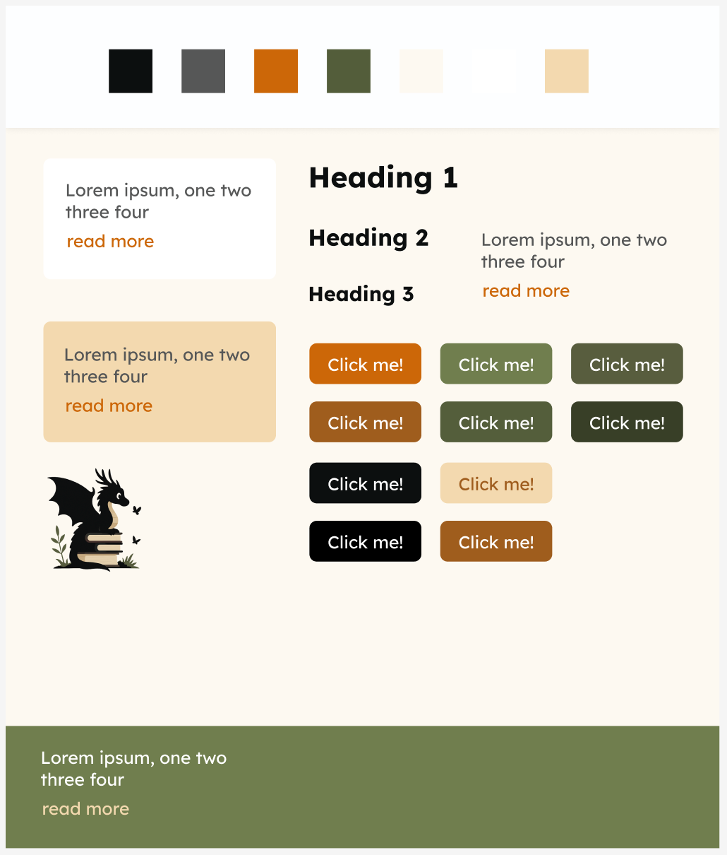
Next thing I needed was the homepage layout. I was curious to see if using a Figma link or a screenshot would help keep the AI on track. Since mobile is so important these days, I tackled that one first.
With the swatches handy it was easy to drop things in place quickly. And as it was meant to be a quick layout mockup, I didn't bother replicating the fancy banners for the headings (time to pickup the kids was looming).

Back to Bolt
With the mockup ready it was time to go back to Bolt. After some thinking over the weekend I realised I did want to use Supabase for the blog after all. Additionally Bolt announced Claude 4 access and I wanted to try out a new prompt with the designs and assets as attachments.
Simplified prompt example:
Build a fully functional, well documented Astro app for MyDragonLibrary.com.

## Tech Stack
- Astro + React + Ariakit + Tailwind
- Google Fonts (Lexend)
- Icons: Lucide Icons
- Backend: Supabase (Auth, DB, Storage)

## Layout
Mobile-first responsive layout.

Top Nav -> sticky, drop shadow
    Logo + "My Dragon Library"  (left aligned)
    Menu -> right aligned, burger menu when mobile
        Home
        Blog
        Tools
        About
Page Content
Footer -> solid color
    Menu
        Home
        Blog
        Tools
        About
    Social Media
        Instagram
        Bluesky
        Twitter
        Tumblr
        Tiktok
    Newsletter signup
    Copyright details -> © 2025 MyDragonLibrary. All rights reserved.
    Privacy Policy
    T&C

## Design
[color and font details here]

Include subtle animations that respect user's preferred motion settings.
All clickables are large and touch-friendly.
Semantic HTML + ARIA support.

## Assets

- Hero image background: /img/empty-library.png
- Logo: /img/logo.png

## Page Content

Stub pages should be empty placeholders, no content, just render layout with “TBD @todo”.

/ -> Home
    h1: <span>Welcome to</span> The Dragon Library
    subtitle: Fun resources for daily reading, wrting and spelling practice.
    Daily worksheet -> card
        h2: Daily Worksheet
        preview image
        p: Here’s what I used with my kids today.
        'Download' -> pdf download button
    Tools section
    Latest blog post -> card
    View all posts link

[ rest of the pages]

## Tools
[tool details]

## Database

[database details]

## Resources

### Social Icons

```jsx
import { Instagram, Twitter, Music } from 'lucide-react';

const BlueskyIcon = ({ className }) => (
  <svg
    className={className}
    xmlns="http://www.w3.org/2000/svg"
    shape-rendering="geometricPrecision"
    text-rendering="geometricPrecision"
    image-rendering="optimizeQuality"
    fill-rule="evenodd" clip-rule="evenodd" viewBox="0 0 511.999 452.266"
    >
      <path fill="currentColor" fill-rule="nonzero" d="M110.985 30.442c58.695 44.217 121.837 133.856 145.013 181.961 23.176-48.105 86.322-137.744 145.016-181.961 42.361-31.897 110.985-56.584 110.985 21.96 0 15.681-8.962 131.776-14.223 150.628-18.272 65.516-84.873 82.228-144.112 72.116 103.55 17.68 129.889 76.238 73 134.8-108.04 111.223-155.288-27.905-167.385-63.554-3.489-10.262-2.991-10.498-6.561 0-12.098 35.649-59.342 174.777-167.382 63.554-56.89-58.562-30.551-117.12 72.999-134.8-59.239 10.112-125.84-6.6-144.112-72.116C8.962 184.178 0 68.083 0 52.402c0-78.544 68.633-53.857 110.985-21.96z"/>
    </svg>
);

const TumblrIcon = ({ className }) => (
  <svg
    className={className}
    fill="currentColor"
    version="1.1"
    id="Capa_1" xmlns="http://www.w3.org/2000/svg"       xmlns:xlink="http://www.w3.org/1999/xlink"
	  width="800px" height="800px" viewBox="0 0 94.955 94.954"
	  xml:space="preserve"
   >
    <g>
	    <path d="M70.589,76.04c-1.395,0.306-16.695,6.845-16.695-9.084c-0.029-6.011-0.006-12.022-0.006-18.033c0-2.651,0-5.855,0-8.953
		c6.407,0,12.226,0,17.932,0V24.506c-6.028,0-11.734,0-17.836,0c0-8.038,0-16.277,0-24.506c-2.814,0-15.247,0-15.247,0
		s-0.106,2.699-1.094,6.677c-2.577,9.132-9.575,17.751-17.683,20.061c0,4.663,0,8.775,0,13.438c3.65,0,6.676,0,10.732,0
		l-0.008,28.769c0,35.523,40.497,25.674,44.309,21.64L70.589,76.04z"/>
    </g>
  </svg>
);

export const SocialIcons = {
  Instagram: ({ className }) => <Instagram className={className} />,
  Bluesky: BlueskyIcon,
  Twitter: ({ className }) => <Twitter className={className} />,
  Tumblr: TumblrIcon,
  TikTok: ({ className }) => <Music className={className} />
};
`` `

[rest of the resources]
Admittedly I am being quite prescriptive here. This is something that works quite well once you have a clearer idea of what you're building and have been through a few iterations.
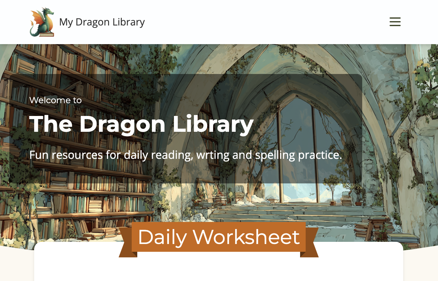
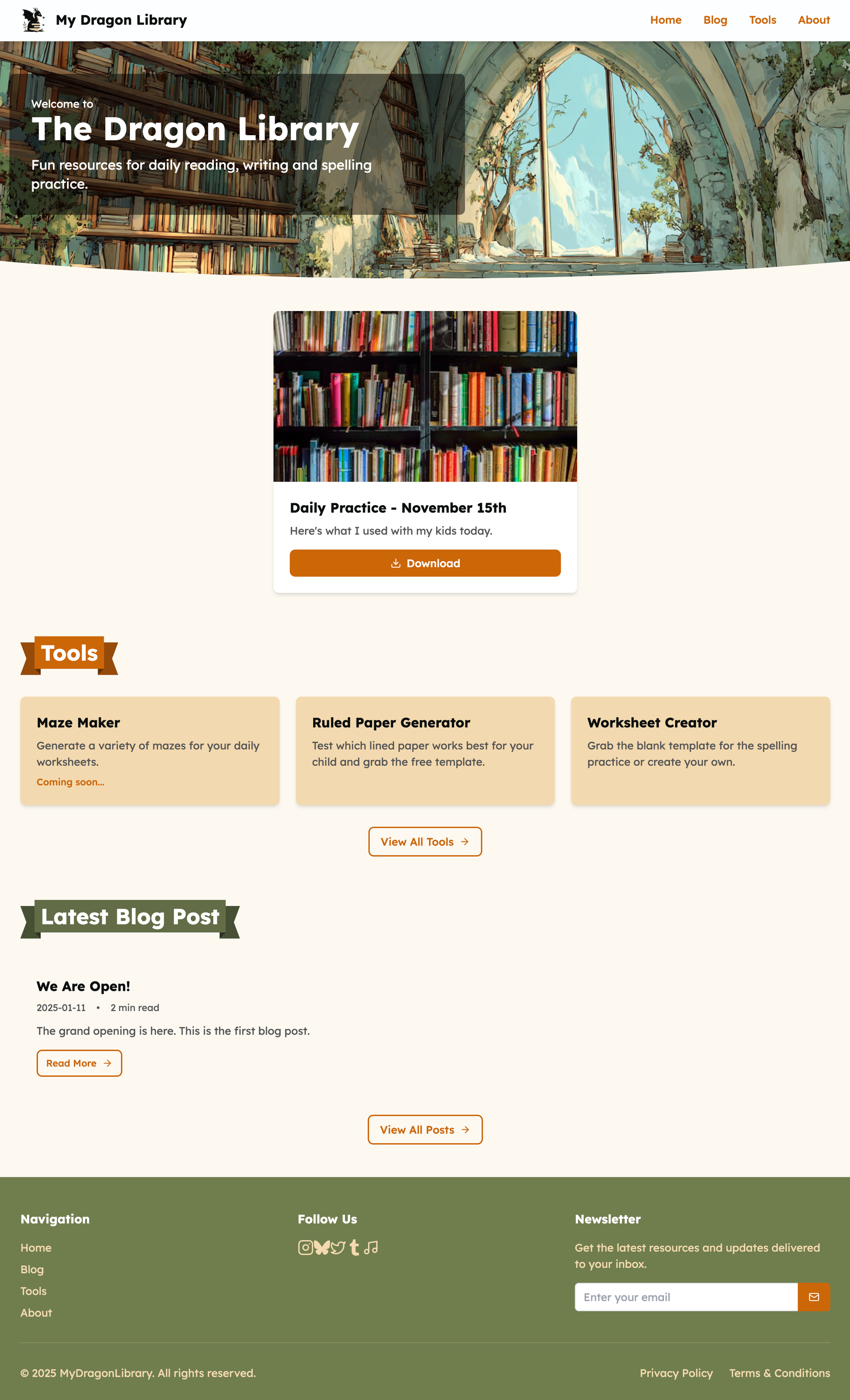
I was pleasantly surprised when Bolt did actually put the logo and the hero image where they were meant to go (I had mixed results with that before), added the banners to the headings and filled out all the elements. The main two hiccups being the hero clip-path was added to the black overlay not the image (fixed in the screenshot below) and lack of spacing between the social media icons in the footer.
It also didn't have the featured card overlap the hero image, but that's not that unexpected. Most of these tools are great following standard layouts, but breaking out of the grid tends to require a lot more hand holding.
Design Tweaks
The good and bad of being a coder is that it's hard not to peek under the hood. I did notice the AI tends to be a bit verbose and adds extra <divs> and classes that aren't always necessary (and that's on top of Tailwind's own verbosity).
Since I was tweaking some of the spacing and text sizes in the header in the code view I did end up cleaning up some of that crud. In the spirit of vibe coding, I probably should have let the AI adjust the text and make the tweaks, but I am saving up my tokens for the tools section. 🙈
It was time to make use of the Hero component a bit more on other pages. Mainly because I figured if I get the design tweaking out of the way this week I won't keep getting distracted by it. That and I wanted as much of the tools page layout to be done before trying to generate the actual tools so that the two tasks don't intermingle.
As an aside, I do find it annoying that I can't get the full chat history from Bolt... once it has scrolled out of view, that's it. Makes going back for extra notes nearly impossible. On the other hand, since I linked my code to github I can at least see the history of changes there. Would be nice if the commits had more details to them or even if conversations made PRs with the chat archived and accessible that way.
There went another half a day of playing with Midjourney to get the perfect images. 🙈🙈🙈
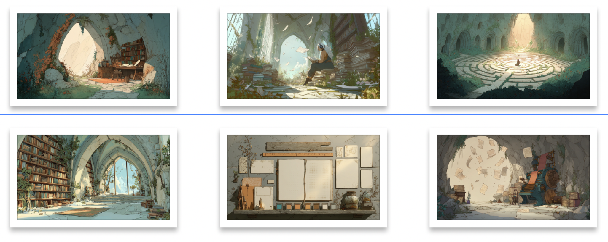
After the Hero component update it was time to tackle the Cards. While the default variants were okay for a generic card, they definitely did not fit my homepage design concepts.
Around this time I started taking advantage of Bolt's locking and targeting functionality inside the code view.
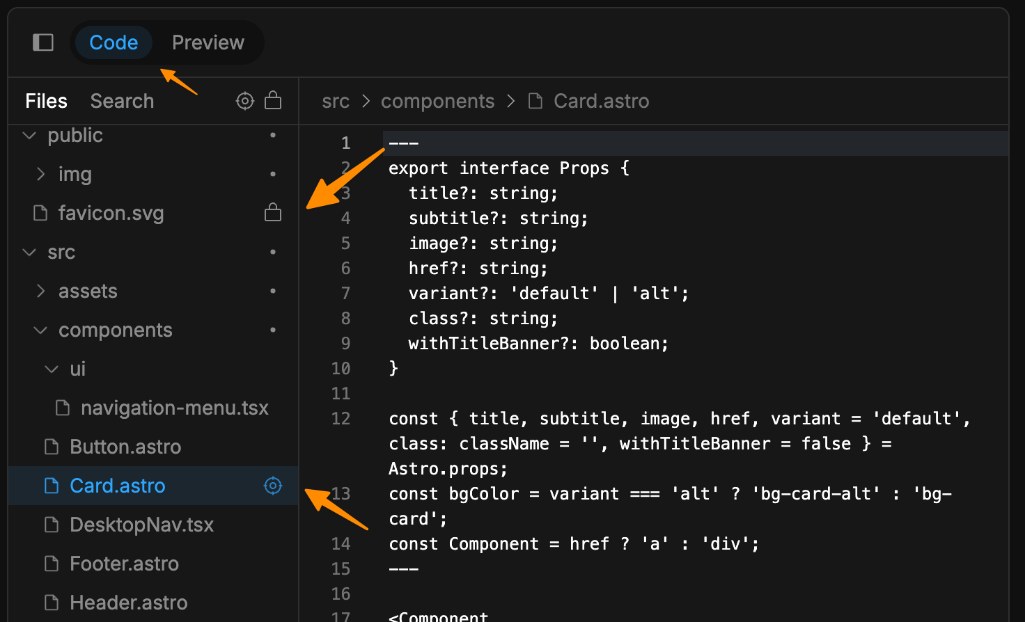
The benefits are:
- no changes outside the targeted files
- less token usage since it's only concerned with the selected files and ignores the locked ones
This works best when combined with the discussion mode, as then Bolt let's you know what it will do before executing the plan. Additionally it will tell you if it needs access to additional files outside the ones you've targeted.
But back to the Card changes. Using the techniques above I've asked Bolt to add withTitleBanner and subtitle props. While not complex and easily done manually, I enjoy the convenience of the AI making the relatively small changes across multiple files in one go. It also nicely handled the fact that the banner title is above the card image when present, while the regular title goes below the image, as well as the optional subtitle for each variant.

Armed with decent card functionality I sorted out the layout of the homepage main sections: Daily Worksheet and Tools. No huge learnings worth sharing here, so I'll spare you the step by step walkthrough. Suffice to say, the main time sink was creating the little dragon mascots for each tool. While I adore the set that is in the current version, not sure if they will stay as I did run into issues with clarity at the smallish sizes they are displayed at.
Desktop and mobile side by side:

I'm still using activities scrappily put together in Indesign, so the daily image isn't the most appealing, but I want to start saving them for posterity and as part of documenting the journey.
Missing Functionality
One thing I realised when updating the Daily Worksheet section is that while Bolt had setup Supabase correctly, even with the minimal sample data I requested, on the actual pages it still used inline mocks. 🙈 So that required an extra step to start using the live data. That said, getting it working only through chatting with the AI was a breeze. I have to applaud the Supabase integration with Bolt here.
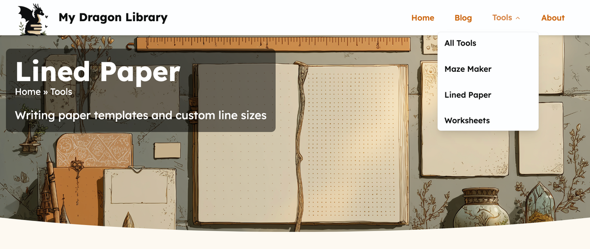
As I started to move my focus away from the homepage a few other missing elements popped up. I added a submenu for the Tool item in the top nav - not having quick access to the subpages was getting annoying. Similarly pages beyond the top navigation could use a visible breadcrumb.

For the dropdown I experimented with using shadcn. It made me realise that maybe I should have included that as a tech requirement in the original prompt. After watching a few videos on this library I'm really warming up to the concept.
This is a good place to stop this overly long update. Again, for those who read this far ❤️ thank you. On one hand it was a slow week, with technically not much progress, but I am pleased with the designs now and it's nice tweaking things while looking at the cute pictures. Next week will be more functionality focused.
Continue reading about Week 3.
