Bolt Hackathon - Week 3

Week 1, Week 2, Week 3, Week 4
TLDR;
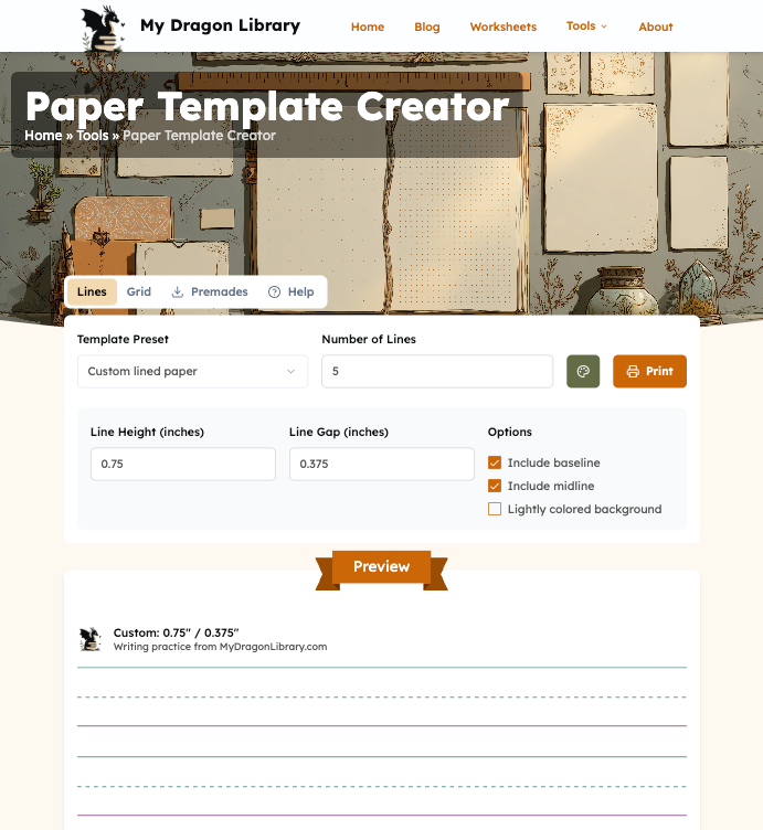
This week I worked on the custom lined paper generator and worksheet list. The CSS for the template creator tool really stumped the AIs. Then I played some more with worksheet and blog list designs.
What Shall We Do With Worksheets

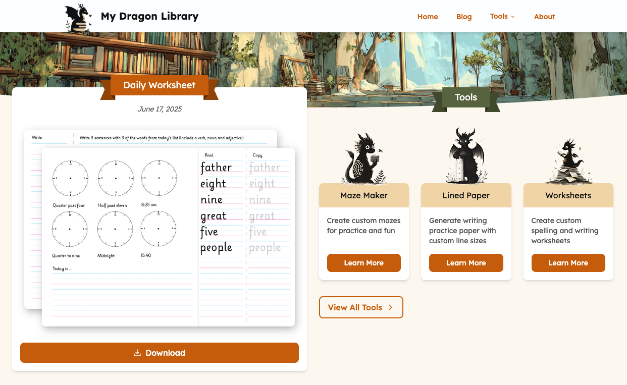
After all the designing last week I realised that the featured worksheet section was a bit of a dead end. I needed somewhere to see previous worksheets (duh!). Here I run into a bit of a decision paralysis as depending on the intention the worksheet entries were not dissimilar from short blog posts with the worksheet download asset attached.
It might not be super clear from the screenshots, but part of the value add to my homemade worksheets is the commentary. The why I chose the elements I did and how they worked for my kiddo.
Worksheet: publication date, no title, tags, preview image(s), download link, content
Blog: publication date, title, tags, preview image, summary, content
With that in mind after some brainstorming I decided to stick with a separate worksheets database table and a new top level menu item.
While the tags might overlap (or not), the downloads, previews and other potential resource related features likely would not. In the end the need for clean data separation outweighed the convenience of handling just one table. I didn't also want to go down the WordPress route, where everything is a blogpost...
The next decision that I kept putting off so far was where to store the assets. The amount of images and pdfs would keep growing over time. The premade templates (in their limited number) could potentially live in the git repo alongside other images, but it didn't feel like the right place either. Since I'm already using Supabase for the project I decided to use their storage buckets too.
Setting the buckets up and uploading the files is quick and easy. It's quite the far cry from the time over 10 years ago when I needed a special app to easily copy files in and out of an S3 bucket 😂 To start with I used the public storage links directly, but eventually I do intend on proxying them to protect from deep linking.
Cleanup Time
With the clearer picture in my mind it was time to cleanup the worksheet records. This is one thing AI can be really helpful with. I wanted to remove some fields from the worksheets table and it was super easy to describe the change and have it applied to: db model definitions, sql migrations, and the html displaying the information all in one go. Exactly the kind of dredge work that is easy to quickly review as a git diff to verify correctness over manually going through all the files.
The code was starting to get a bit unwieldy at this point, though. Prototyping in mostly a one page file is all nice and fine, but as I've settled into my design decisions, being able to reuse components and styling without repeating many many classes (thanks Tailwind...) was becoming more important.
Bolt does a decent job at refactoring and extracting (as do most AIs) though it does sometimes like to rewrite minor tweaks back to it's own original version. It's not super common, but happens often enough, that makes me sadly not trust it, especially with code I spent time tweaking the styling of. This is also an area where I keep itching to jump back into Cursor and have more visibility over what changes are made without having to go check things in github. Alas, I persevered.
One thing that I keep running into is the token anxiety. Since I've given myself a goal of keeping costs low for the hackathon I've fallen into the trap of over optimising for lower usage likely at times at the cost of potentially better output.
On a few occasions I had to go back and explicitly tell Bolt to use the existing card or image stack components instead of pure tailwind classes it defaulted to. The original oversight was likely due to the narrow file targeting (I try to keep edits to 2-3 files at a time) and the AI trying to stick to only the minimal context it had. In turn this might have made me waste more tokens overall as I had to re-prompt and ask for component usage 🤦♀️ Clearly being a dev is coming back to bite me here...
Learning Astro and Tailwind
I never was one for patiently following tutorials. And often even if I use them it's with an own project that follows the steps but not necessarily the content. I find that helps me learn and understand better as I adjust elements to my needs rather than copy pasting instructions. Also after 25+ years of coding it is a bit hard to sit down and patiently read all of the documentation when you're itching to start actual work.
So in many ways the hackathon website has been me learning about Astro (zero prior knowledge) and Tailwind (played with it in the past). If not for the limited timeframe, I would have maybe read up more about the concepts prior to starting. But as it is I have run a few times into a situation where I couldn't do what I originally wanted to or had to refactor some .astro files into frontend components. It has made me think more deeply about the site architecture though.
This is not to say that it's reasoning is trustworthy either. But it can give you an insight into potential limitations.
At this point it was time to try out the deploy process. Generally linking with Netlify on Bolt is a smooth process. The deploy itself went well, but it did make me revise some assumptions about Astro. A few more components had to be moved from .astro to .tsx to account for dynamic access to Supabase stored data.
In the moment I thought I wanted the site to automatically pick up on new blogposts/worksheets being added. But since then I'm leaning more towards letting Astro handle those by triggering a rebuild when posting (with possibly some scheduled builded for future publishing date handling). Though this is the kind of optimisation / refactor for after the hackathon.
Custom Line Generator
With the ever shrinking pile of tokens I was getting a bit more organised about adding new features. So for the line generator I went ahead and mocked up a design first in Figma. One thing I really like about using Figma and established libraries, is that most provide Figma files with their components. That makes visual prototyping really quick with something like Shadcn.

While working on the mockup I did some research on similar tools which helped me come up with a detailed prompt.
Create the custom paper page as per the mockup.

## Hero:
title="Paper Template Creator"
image="/img/hero/lined-paper.png"
breadcrumbs={[
	{href:"/tools",label:"Tools"}
]}

## CustomPaper component

React component as this should be dynamic.

### Config section:
Use shadcn form, dialog and tab components.
Tabs: Lines, Grid (tbd)
Lines tab (default):
- select dropdown with Zaner-Bloser presets to select from + 'Custom lined paper' at the top
- button with a palette icon that opens a dialog with colour selection for base line, top line and midline
- line height value in inches (optional for custom preset only)
- line spacing value in inches (optional for custom preset only)
- midline (x-height) checkbox (optional for custom preset only)
- radio selection between portrait and landscape page
- print button that sends the preview section to the native browser print dialog

Grid tab: "@todo" in the content area

### Preview section:

h2 Preview
h3 site logo + two lines of template info -> l1: template preset, l2: "Writing practice from MyDragonLibrary.com"

Lines repeated as per the specification inside a 500px high container.

The lines should be drawn using a css linear gradients.

I was pleasantly surprised to get a functional prototype on my first go! Even the colour picker worked. :D

There were a few minor issues - the default colours were not quite right and the layout would need some tweaking (and of course it refused to do the overlap over the Hero component). This is also where I noticed that Bolt likes to generate shadcn components unless explicitly told to use the command line functionality.
Use shadcn/ui components for primitives and common blocks. Any shadcn/ui component should be installed via command line, not generated.The Devil's In the Details
The Devil's In the Details
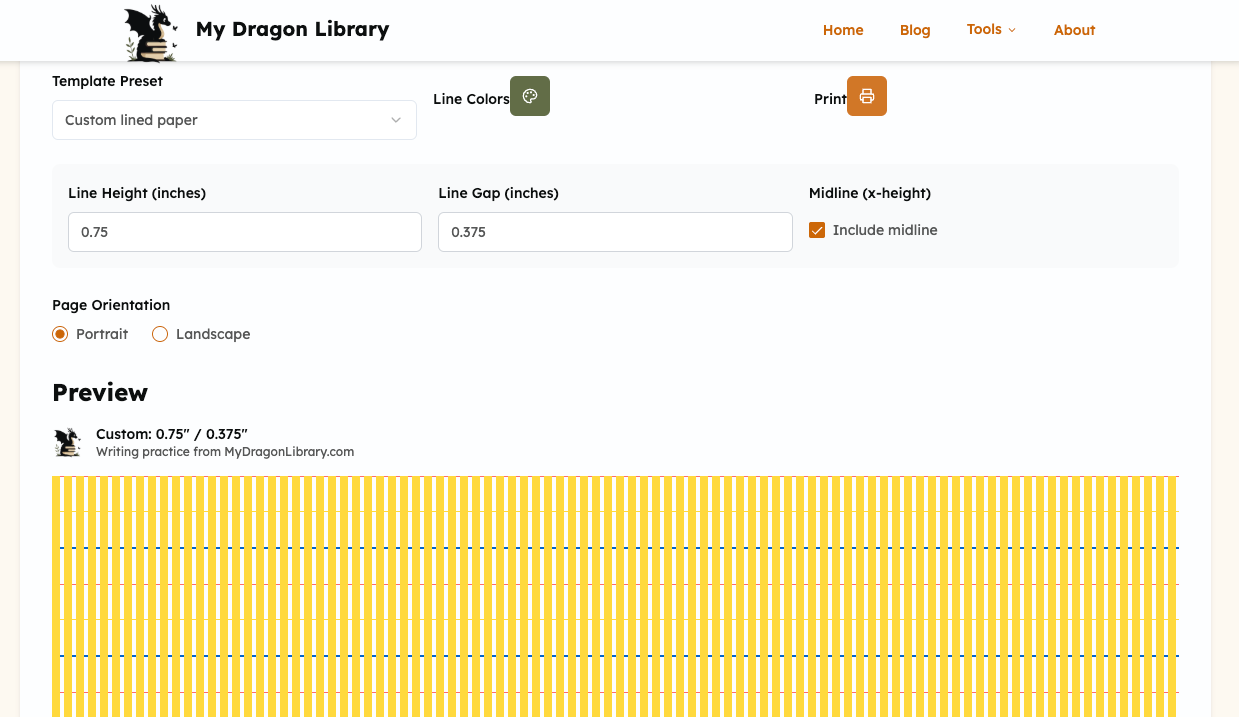
While it was a good starting point on closer inspection I was missing some important elements:
- the midline was not dashed
- the print functionality generated a page to print, but the preview shown a blank screen
- on the print preview page the logo image was broken
- the line colours were not quite what I needed
- the portrait / landscape switch did nothing
The print functionality issues turned out to actually be pretty minor. I noticed it worked with background images turned on, and using print-color-adjust was enough to fix it. While trying to fix the line rendering (more on that later) I also had some lines disappear in print, but that turned out to be caused by scaling being less than 100% in the print dialog. I realised that was a point worth addressing in the help section.
{
/* ... */
print-color-adjust: exact;
-webkit-print-color-adjust: exact;
color-adjust: exact;
}
Finally, the logo image had the correct url, but it wouldn't load on a generated page when using Bolt. Same code deployed to Netlify worked just fine, so I guess this is just a quirk of the Bolt setup.
For the portrait / landscape setting, I realised I didn't really have a need for it and could let the user handle this in the print options. ✂️✂️✂️
The big hurdle turned out to be the lines themselves. While getting repeating lines using a repeating gradient was simple enough, getting the dashed line in there did not compute for the AI. When asked to address the missing dashes I got this...


I ended up doing a bit of manual research on making these lines. Funny enough I went through ChatGPT, Claude, and Gemini seeing if either would provide a decent answer. They did not. A bit of variation in the responses, but overall they all either ignored the dashed line requirement or did it wrong.
Even after giving the AI hints about using gradients and conical gradients (this Stackoverflow question helped a lot in getting the final result right) as well as splitting the solution into two classes rather than trying to do everything in one go, the AI just wouldn't get it. And this is again a time where I've only persevered with pestering any of the AIs as long as I did for the sake of the experiment. Typically if the result is so bad and I have a clear idea of what I want the code to look like, I'd do it myself. As is often the case, the AI is pretty good at generating the scaffolding, but it needs a human for the details.

On top of the rendering issues I had to deal with a few edge cases (e.g. the gap being 0 and the lines merging weirdly). Some of the presets for older writers called for the same colour topline and baseline so I added a checkbox to easily reuse the same colour for both. I also realised that sometimes it's hard to see where the writing space is, so now there's also an optional light grey background within the line making the gaps more obvious.
Lastly I debated autofilling the space with as many lines as there was space, but to not cut off the lines at say the midline would require extra calculations and added unnecessary complexity to the MVP. Hence the number of lines option. Letting the user specify how many lines they want actually allows for more freedom, since you can then leave blank space for other things below the lines and is more compatible with different paper sizes and layouts.
I took some time to write up the help section, which is now complete including a helpful little infographic. It was also a good opportunity to restructure the pages a bit. Originally the Tools > Lined Paper link lead to a page with the downloadable pre-made templates and a link to the template creator. I ended up moving the resources to a tab within the template creator itself, so that the downloads are in a handy and visible spot without adding extra steps to access the tool.
Worksheet Display
With the paper template creator completed I moved back to the question of Worksheet display. I spent some time thinking about the best format for the listing page and the typically low amount of content for each entry. This lead me to consider a calendar view.
Once again telling the AI to create a new page and link to it in the header, footer and the homepage is such a time saver. Even for just a blank stub. But since I had a decent idea for the calendar view and some existing content to work with I added a request for a functioning page.

Not bad. Having a working prototype straight away made it easy to verify a lot of assumptions. What felt right in my head didn't work so well on the page. Especially for mobile views. But even on desktop the preview images weren't readable.
I considered a different calendar design and dropping the preview inside the calendar in favour of a more minimalist look with just colour or dots marking the days content was available. But when I stepped back to think about the purpose of the worksheets and browsing the list I realised the previews were important. While some might want to follow my journey day by day, others might want insights and ideas related to a particular element of the worksheet. And that would likely be more important then highlighting how many days this month I've posted... I didn't want to drop the time association completely though.
Enter timelines.
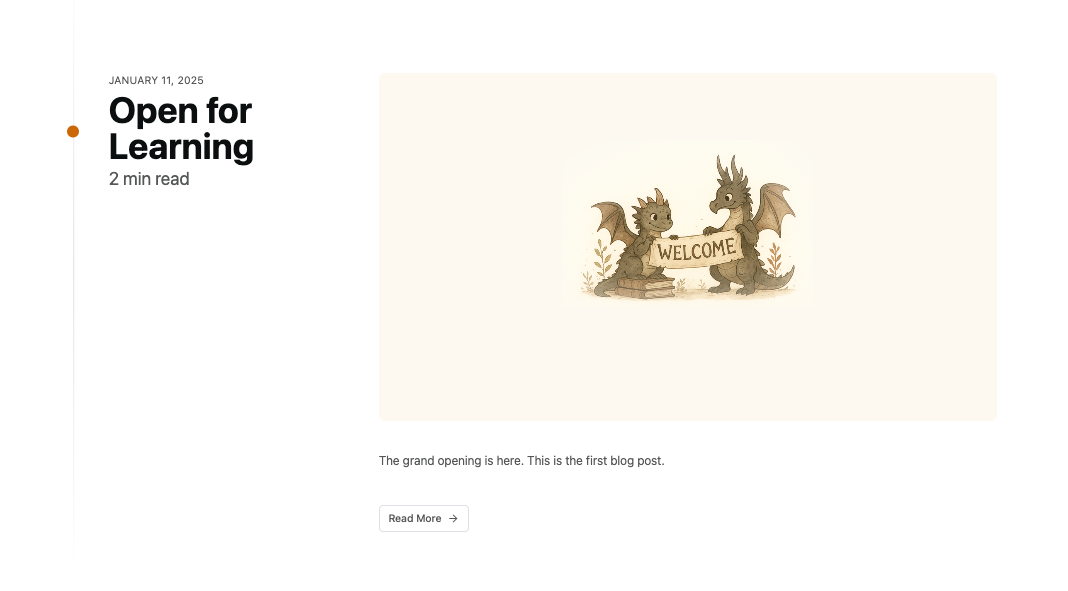
When I was browsing calendar components on 21st.dev this timeline component caught my eye. On a side note, I'm really enjoying following the shadcn copy&paste philosophy - it was really easy to customise the colours and tweak some of the layout elements to work with what I already had on the site.


In fact I liked the timeline component so much, that I switched the blog list display to it too, with a few tweaks to the way the title and meta info is treated. :D

Other Notable Changes in Week 3
- Updated the About page with a Hero
- Added optional breadcrumbs in the Hero component
- Cleaned up mobile footer spacing
I'm slowly realising that writing these updates is taking me nearly as much time as I'm spending on the work 🙄 Taking notes through out the week, helped a bit, but still between slow typing and adding screenshots and verifying links... it's taken all of my weekend free time (fine there wasn't that much of it to start with but still more than just a few hours). I keep wondering if daily updates would be more efficient, even if less good at catching some retrospective realisations. 🤔 Might try it for Week 4.
What's next? With the deadline for submissions now getting close, I'll be cleaning up what I have and adding more daily worksheet entries, as well as a blog post or two so that the site can actually go live soon. I'm dreading the video requirement for the submission though. 😬 As always, thanks for reading ❤️ and until next time!
Continue reading about Week 4.

